Findasense: Global Digital Ecosystem Redesign
UX/UI Design · Design Thinking · WordPress 6.4 · Multilingual (ES/EN/PT)
The Context: From Corporate News to Lead Engine
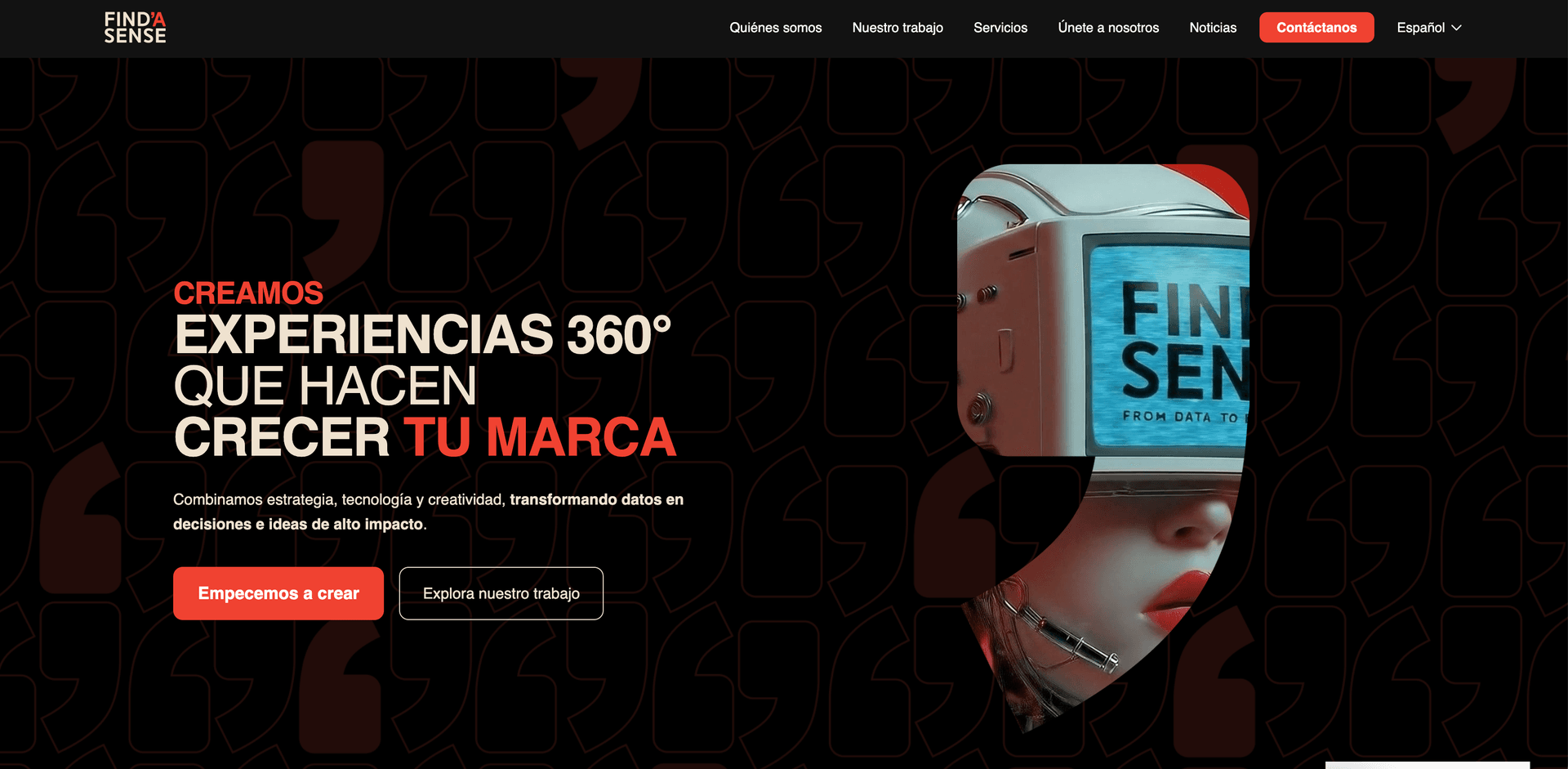
Findasense, as a global digital transformation consultancy, needed a website that not only informed but also demonstrated its expertise. The previous site suffered from “design debt” and a confusing architecture: the main Hero was internal news about its acquisition by TP Infinity, wasting the most valuable space to communicate its value proposition.
My challenge was to rebuild this digital identity under one premise: The user doesn’t want to know who you are until they understand how you can help them.
Design process
My methodology focused on transforming technical complexity into a seamless and consistent user experience on a global scale.
01 — Discovery: UX Audit and Benchmark
We didn’t start by designing; we started by analyzing. I conducted an audit that revealed 60% of friction points were structural.
Detected Critical Points:
- Cognitive Overload: Overlapping sections like “What we do” vs “What problems we solve.”
- Lack of Hierarchy: All content had the same visual weight, making scanning difficult.
- Blind Navigation: Sections like “Insights” didn’t allow users to return Home, breaking the user flow.
- High Friction Form: Too many fields and steps, causing the conversion rate to plummet.
Competitive Analysis (Benchmarking): I analyzed leaders like R/GA, MRM, GUT, and Globant. I extracted success patterns that we applied to the project:
- Bold Typography + Uppercase: To convey authority and a modern editorial tone.
- Modular Layouts: Inspired by Huge, allowing the web to be scalable and easy to read.
- Micro-interactions: Subtle red hovers (branding) to guide the eye toward action.
02 — Strategic Definition: The 3 Pillars
Based on the findings, we defined three pillars of action to guide the redesign:
- Clarity: A direct value proposition in the Hero and texts optimized for quick scanning.
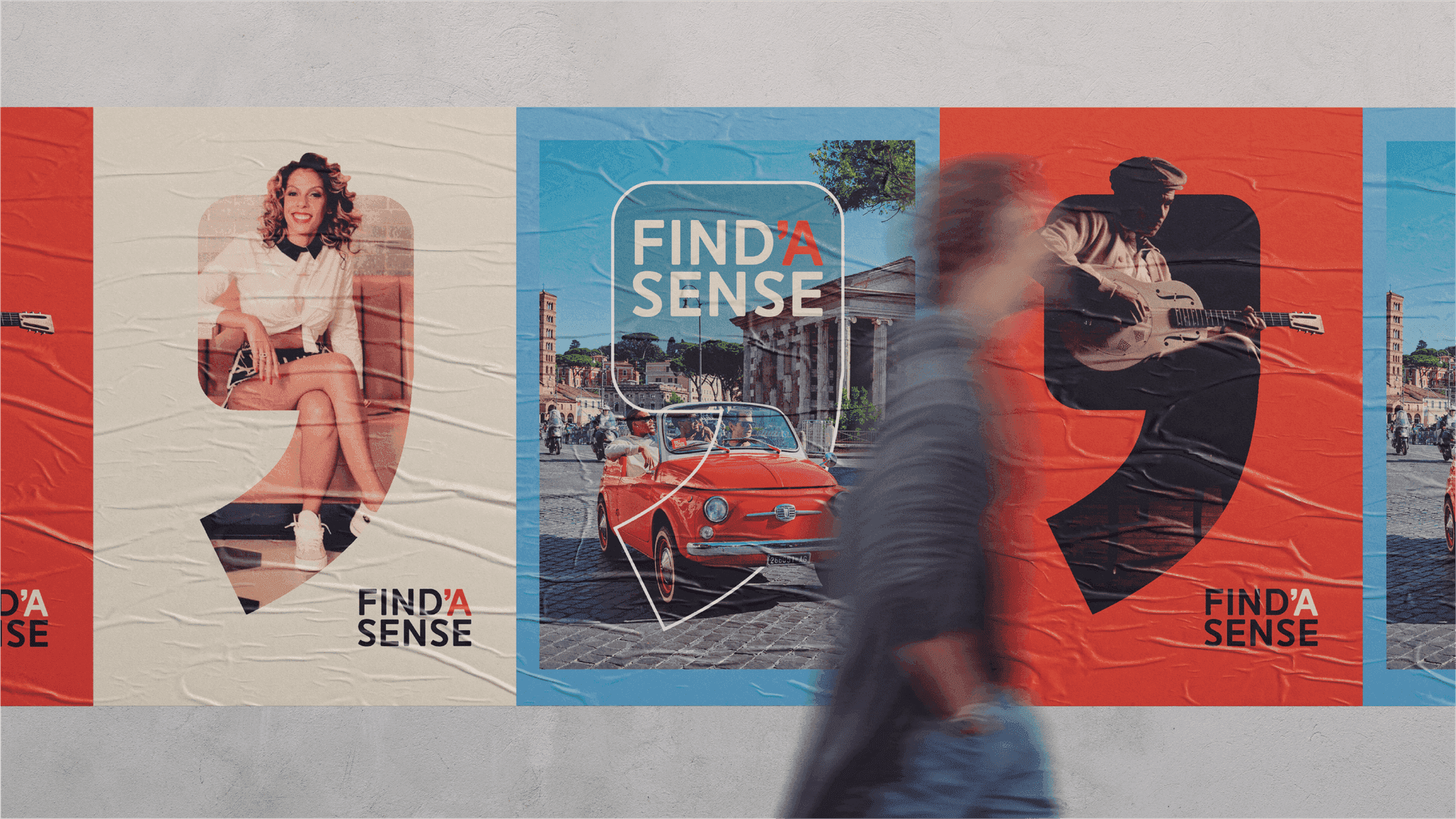
- Trust: Visual prioritization of Success Stories and Clients (Coca-Cola, Lenovo, Bimbo) from the first scroll.
- Conversion: Redesign of the contact form to a simplified 5-step single-field model, reducing abandonment.
03 — Architecture and Content Strategy
I proposed a total restructuring of the Sitemap, inverting the traditional order to prioritize conversion and expertise. Here is the new global ecosystem organized by functional nodes:

- UX Writer Decisions: We eliminated redundant language and unified methodology and culture sections under “Who we are.”
- Persistent Navigation: We redesigned the Header to include a consistently visible contact CTA and a language selector (ES/EN/PT) accessible from any level.
04 — UX/UI Design: Visual System and Prototyping
The design was built in Figma using a Design System (UI Kit) designed for technical implementation in WordPress 6.4.
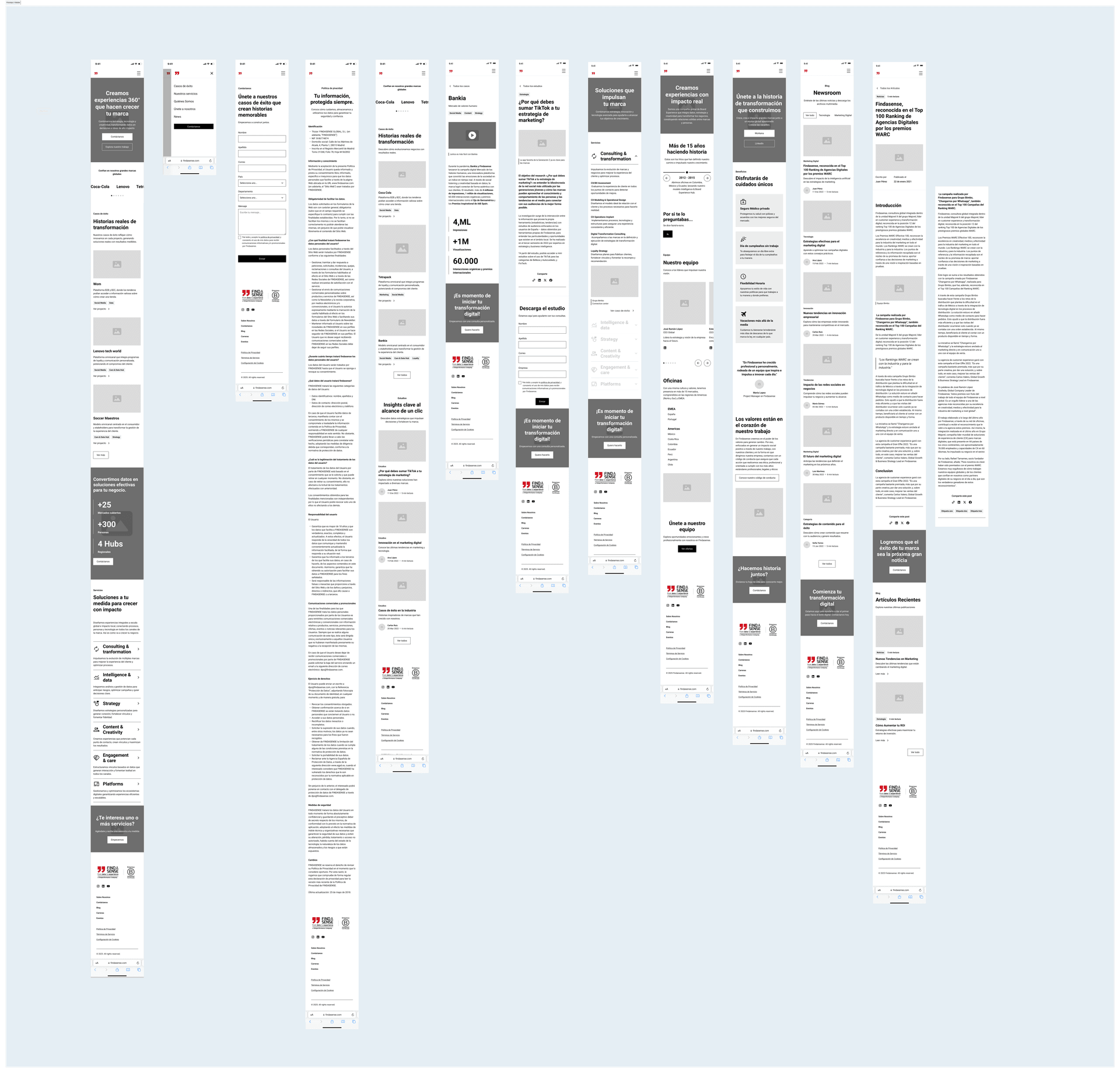
Low-Fi Wireframing: We defined the user flow ensuring there was never a “dead end” (especially on news and press pages).
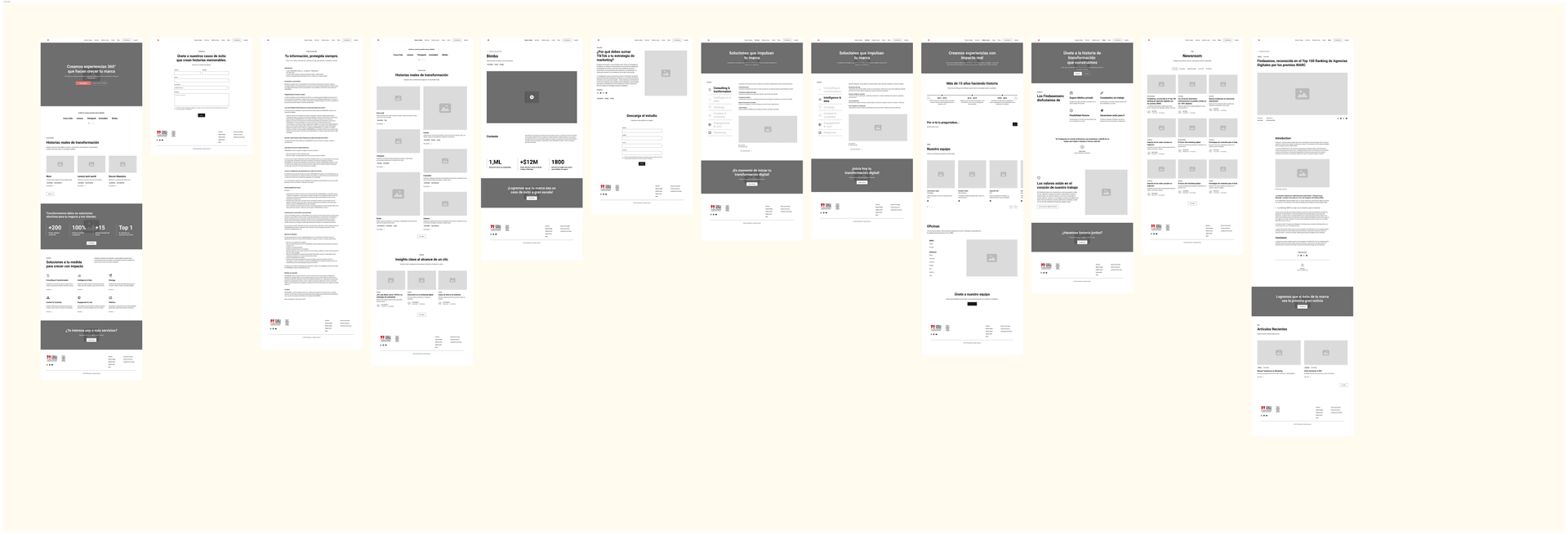
High-Fidelity Design:
- Modulation: Sections divided by color blocks to visually separate services from success stories.
- Visual Identity: Implementation of “Findasense Red” as an accent color in keywords and consistent buttons.
- Mobile First: Every component was tested to ensure legibility on mobile devices was as powerful as on desktop.
- Interactive Prototype: I delivered a navigable prototype that allowed the internal Findasense team to experience transitions and the form flow before moving to development.
05 — Technical Feasibility and Testing
Since the site would be implemented in WordPress 6.4, every designed block was validated with the development team to ensure it was feasible through Gutenberg or visual builders, avoiding unnecessary code that would affect loading speed (WPO).
We conducted weekly reviews adjusting:
- Message clarity in the Hero.
- Tactile response of buttons on mobile.
- Multilingual consistency in complex layouts.
Final Solution and Impact
The result is a minimalist, powerful, and results-oriented website that redefines Findasense’s digital presence.
Positioning
Findasense now visually competes with the best agencies in the world, conveying authority and modernity.
Usability
Navigation errors were eliminated, and click depth to reach key information was reduced.
Conversion
The new simplified form is designed to significantly increase the volume of qualified leads.
Scalability
A robust component system ready to grow and adapt to the consultancy's future needs.
Project Deliverables
- UX Audit and competitive Benchmark.
- New Sitemap and Information Architecture.
- Low and High Fidelity Wireframes.
- Full UI Kit: Variables, components, and styles.
- Interactive prototype in Figma.
- Style guide for WordPress implementation.
Final Result: Digital Ecosystem
Explore the experience designed for Findasense’s global ecosystem.
Click on the image to explore the real website ↑