Grip: Health Tech E-commerce
UX/UI Design · User Research · Mobile First · Health Tech
The Context: Democratizing Hormonal Health
Grip is a Dutch startup with a clear mission: to give people with a uterus control over their hormonal health and fertility through at-home blood tests. As a UX/UI Designer Intern, my goal was to transform a functional but limited web experience into a trusted, educational, and conversion-oriented digital ecosystem.
The original site used a generic template that didn’t reflect the brand’s medical authority or respond to users’ emotional needs. With 90% of traffic coming from mobile devices, the absolute priority was a redesign under a Mobile-First strategy.
01 — Discovery and Empathy: Understanding the Taboo
We couldn’t design for hormonal health without understanding those living it. I conducted a deep research phase to identify why users were abandoning their carts or didn’t fully trust the service.
Detected Friction Points:
- Lack of Medical Trust: The design didn’t convey the necessary security for a product requiring a blood sample.
- Complex Offering: Users didn’t understand which test they needed (Fertility? PCOS? General Health?).
- Mobile Barriers: Elements were too small, texts were dense, and navigation made closing a purchase difficult.
Diagnostic Tools: I used Hotjar and Google Analytics to map user behavior, detecting that 60% of bounces occurred on the product selection page due to information overload.
02 — Design Strategy: Trust and Clarity
Based on the research, we defined three strategic pillars:
- Visual Authority: Evolution of the design system to balance the closeness of a startup with the sobriety of a medical lab.
- Proactive Education: Implementation of content blocks explaining the process simply (Test > Lab > Results).
- Zero Friction: Redesign of the checkout flow to reduce steps and optimize fields on mobile devices.
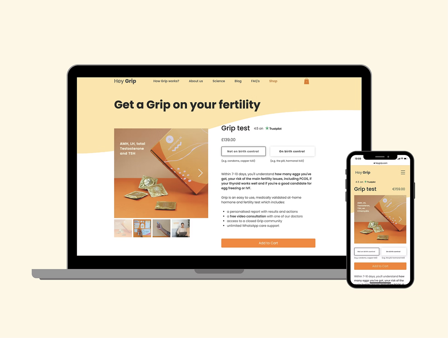
03 — Execution: Redesigning 80% of the Ecosystem
I worked side-by-side with the product team and founders to redesign key pages of the site:
Home Page Optimization:
- Replaced dense text with clear value propositions.
- Included social proof (Trustpilot and testimonials) at strategic points.
Product Page (PDP) & Questionnaire:
- Redesigned the product selector to be intuitive.
- Introduced a visually guided “Health Quiz” that helped users discover the right test for their personal situation.
Results Dashboard:
- Improved visualization of medical data so it would be understandable for someone without healthcare training, using clear graphics and actionable recommendations.
04 — Impact and Results
The redesign didn’t just improve aesthetics; it had a direct impact on the startup’s business:
- 10% Monthly Growth: Sales maintained constant growth thanks to improved user trust.
- Conversion Optimization: The conversion rate stabilized above 1% even with increased traffic, eliminating critical bottlenecks on mobile.
- Design Efficiency: I created a component library in Figma that allowed the marketing team to launch new campaigns and landing pages in half the time.
Project Deliverables
- UX Audit and heatmaps (Hotjar).
- Complete Mobile-First interface redesign.
- User Flows for the purchase process and receiving results.
- UI Component library for Wix/Custom Code.
- Interactive prototypes for testing with real users.
Lessons Learned & Reflections
Reflecting on this project, these are the three main lessons I will integrate into my future workflows:
-
Simplicity beats traditional navigation: Sometimes, following the standard E-commerce pattern (Home > Shop > Product Page > Checkout) creates too much friction. By merging the shop and product pages, we proved that reducing steps from 5 to 2 was exactly what the user needed to feel secure when purchasing a complex medical product.
-
Designing with technical constraints is an advantage: Working with Wix taught me to balance creativity in Figma with technical feasibility. I learned that it is better to design a robust, quickly implementable solution than a visually complex proposal that the CMS cannot support, thus accelerating Time-to-Market.
-
Data tells the story, but qualitative feedback provides the solution: While Google Analytics showed us what was happening (high bounce rate), it was the user comment on Confluence regarding confusion with PCOS that gave us the “why.” This reaffirmed my conviction that numbers and user feedback must always go hand in hand.